Tuesday
Jul312012

Everywhere Project

This summer I have travelled to Manhattan, Boston, Providence, Sudbury and all points in between.  Where have you been?

Seeing the Everywhere Project makes me want to hit the road again. Designer Adrian Walsh identified all of the locations mentioned in the song 'I've Been Everywhere', and asked designers and illustrators to create luggage labels for each of the 92 locations. It was written by Hank Snow in 1962, adapted from an original Australian version.

So many beautiful designs. I am proud to have participated in this collection. Here is my contribution:

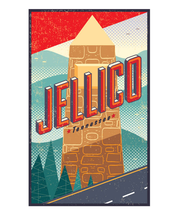
Jellico lies on the Tennessee side of the State Border, south of Kentucky. A small stop just off I-75, a village by the wayside. I have passed through this area on numerous marathon road trips, a winding stretch of road surrounded by the misty Cumberland mountains.

I illustrated the cairn that stands on the state line between Kentucky and Tennessee.

Check out these locales:

Ottawa by Matt McCracken of Doublenaut

Panama by Sorry You're Happy

Mattawa by Jim Datz

Ombabika by Poly Studio

So many places, so little time....

Tuesday
Jul172012

Ice Cream for Crow

Sitting in my studio, semi-delirious from the heat. A couple of things spring to mind: Captain Beefheart's video Ice Cream for Crow (so cool and so hot) and a poster project for Intrepid Theatre in Toronto. Feeling the heat like a human cannonball. Looking to get to the beach as soon as possible. Wish I could launch myself into the water.

 Worked with Clint Hutzulak at Rayola Design on this project. Love doing posters!

Everybody is fighting for their slice of the pie these days, including those in the legal profession. Here is the latest cover for Canadian Lawyer.

Summer is a season of unrest. Stay cool, folks.


Thursday
Jul052012

Loco

Crazy. It's not every day I am handed a manuscript with leeches, steamrollers and exploding heads. Not to mention a portal into another dimension. I love working with Irene Gallo at Tor.com. So many amazing writers. I've had the priveledge of working with Charles Stross and John Scalzi. Rudy Rucker and Bruce Sterling teamed up on this ripping, high-adrenaline sci-fi adventure. Desperate times call for desperate inventions.

I am not going to try to describe the story further, other than to say - check it out! Give it a read, right here.

Sketches:


I really liked the kissing leeches, with flaming lips, but we agreed the best sketch had a more human element to it. Working with sci-fi is like getting out of a car after a long ride. It feels good to stretch your legs and have the freedom to move in new directions.

Tuesday
May292012

Strong Words for a Polite Nation

Creative freedom. I have worked on books, been handed manuscripts and have always made an effort to satisfy my creative abilities by initiating new projects. Back in 2008, I had the opportunity to illustrate an entire issue of In Character, the Grit issue. This past spring, I was contacted by publisher Brian Kauffman, who offered the chance to work on a cover-to-cover design of SubTerrain.

SubTerrain is a Canadian arts and literary review, offering short stories, poetry and art. Its tagline is 'Strong Words for a Polite Nation'. I haven't had the chance to work illustrate fiction and poetry very often. I reviewed the articles, scribbling down the images springing to mind. I wanted to create strong images to go with the words.

Working on this project was like an all-you-can-eat buffet, or a night at a gourmet restaurant. One tasty dish after another, each with a different flavour. Here are a few of the courses served up:

'Detachment' - a short story about a remote RCMP detachment, a stray dog, and the struggles of a young family, from the viewpoint of the oldest daughter.

'Beautiful Bratislava' relates the struggles of an aging poet, peddling his latest volume of collected works.


'Uncertainty Principle' - artwork to accompany a poem.

I was honoured to have my work regognized American Illustration jury. The following two pieces were chosen. Creative freedom and artistic affirmation. A great combination.

'The Red Mouths' - a coming-of-age story of an inner city girl, and the object of her affection.


'Passing' - finding a place in between high school and higher education, between two different countries and cultures.


Monday
May282012

Juggling Type and Dancing Bears

I always enjoy adding lettering into my artwork. This cover for Anvil Press' Valery the Great allowed me to design the title type, layout and illustration. This book just hit the shelves and has been receiving great reviews.

I got the call from Rayola designs last fall. Working on a book cover is always an exciting challenge, like jumping into a pool of endless possibilities. The book is a collection of stories, one of which centres on a young woman who performs on skates with a Russian dancing bear. I wanted to capture a retro, small-town circus feel in the type and the illustration.

Here's a brief synopsis:

Valery the Great is a crackling, electric collection of dark humour that follows the bizarre and beautiful lives of its protagonists. Sometimes sweet and gentle, sometimes sharply sarcastic, the unique narrative voices in this collection are always powerfully touching.

I was given some suggestions by designer Clint Hutzulak. Here are some of the thumbnails submitted.

I was asked to 'weird things up' as much as possible by the client. How awesome is that? To emphasize the mythical nature of the bear, I used a map of the constellations as a backdrop, putting it in place of Ursa Major. I used a simple colour scheme and added in playful elements.

Here is the illustration with the type sketched in.


I was told by the author the cover was everything she could hope for. Everybody wins.

“The writing is lively, like good gossip at a journalists' watering hole or a fighters' hangout. McCluskey is a vigorous, colourful and often humorous writer, with a sharp and sometimes wicked eye.” -- The Globe and Mail.