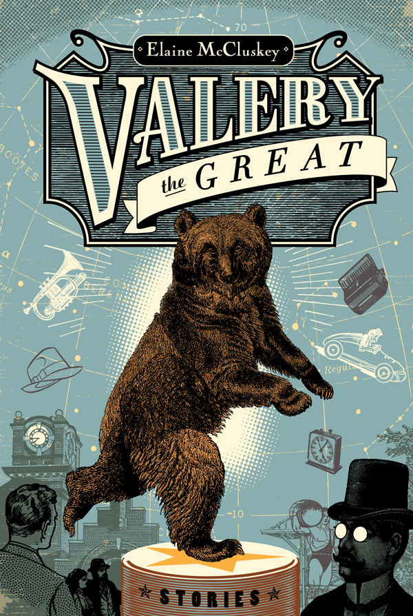
I always enjoy adding lettering into my artwork. This cover for Anvil Press' Valery the Great allowed me to design the title type, layout and illustration. This book just hit the shelves and has been receiving great reviews.
I got the call from Rayola designs last fall. Working on a book cover is always an exciting challenge, like jumping into a pool of endless possibilities. The book is a collection of stories, one of which centres on a young woman who performs on skates with a Russian dancing bear. I wanted to capture a retro, small-town circus feel in the type and the illustration.
Here's a brief synopsis:
Valery the Great is a crackling, electric collection of dark humour that follows the bizarre and beautiful lives of its protagonists. Sometimes sweet and gentle, sometimes sharply sarcastic, the unique narrative voices in this collection are always powerfully touching.

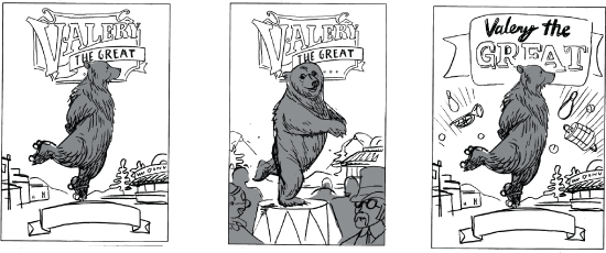
I was given some suggestions by designer Clint Hutzulak. Here are some of the thumbnails submitted.

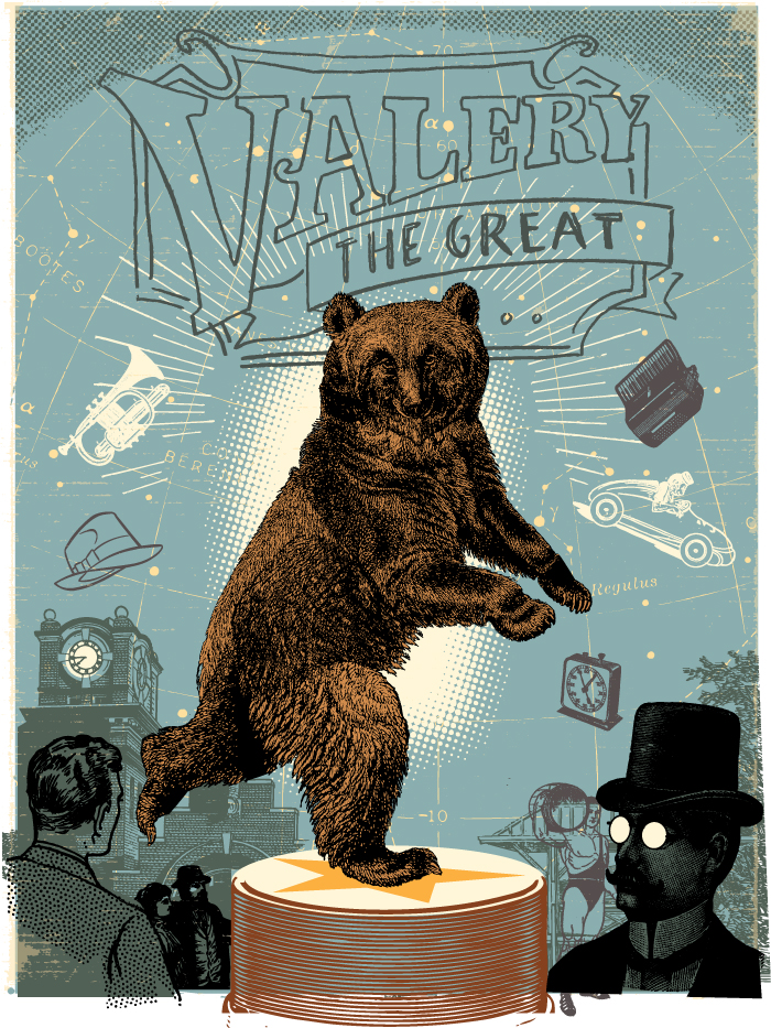
I was asked to 'weird things up' as much as possible by the client. How awesome is that? To emphasize the mythical nature of the bear, I used a map of the constellations as a backdrop, putting it in place of Ursa Major. I used a simple colour scheme and added in playful elements.
Here is the illustration with the type sketched in.

I was told by the author the cover was everything she could hope for. Everybody wins.
“The writing is lively, like good gossip at a journalists' watering hole or a fighters' hangout. McCluskey is a vigorous, colourful and often humorous writer, with a sharp and sometimes wicked eye.” -- The Globe and Mail.

 design,
  lettering,
  project,
  type,
type,  typography
