Above the clouds
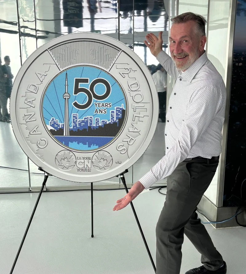
A new two-dollar coin was launched on March 31 in Toronto. It was a rainy day at street level, but as we rode the elevator up to the Observation Deck, we could see the cloud tops below. It felt a bit like science fiction, like the future. The event celebrated the 50th Anniversary of the CN Tower, an iconic representation of the city. I started illustrating the design for the coin a year earlier, and now it was time to celebrate. Keeping the project under wraps that long felt like forever, but this felt like liftoff.
I was honoured to be included in the media event and the unveiling. The event was full of energy, the people at the Mint were welcoming and the day was incredibly well organized. There is immense pride in the quality of the coins which was reflected in the ceremony.
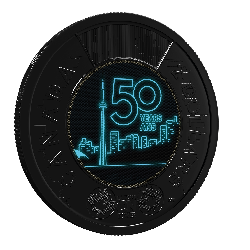
Glow in the Dark
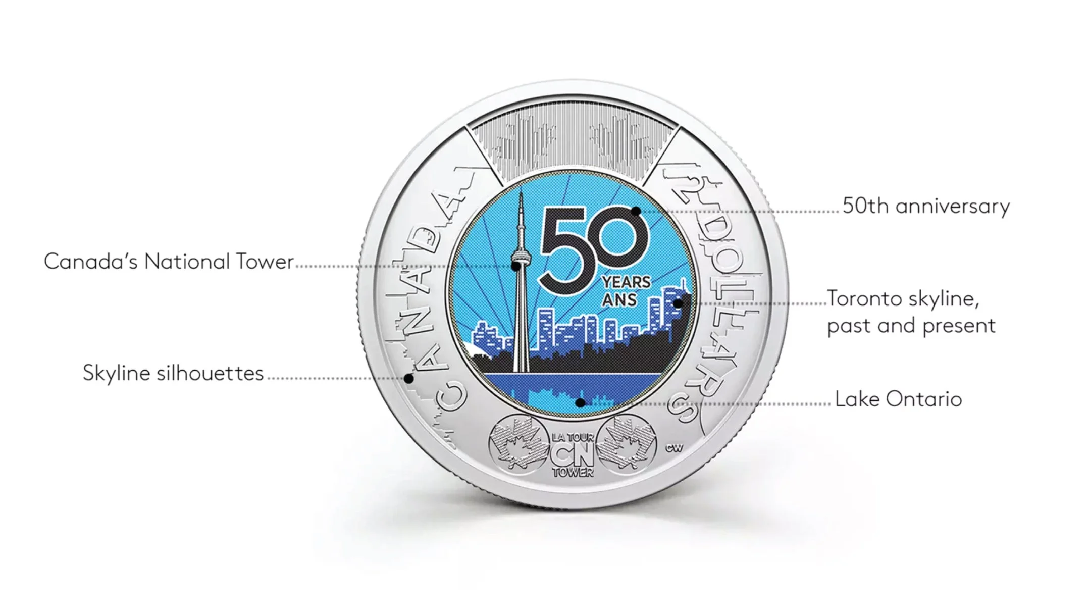
The two dollar coin (Toonie) will be produced by the millions for general distribution. It was a big task to meet the standards of the Mint, keep the folks at CN Tower happy and create an interesting narrative that fits in the palm of your hand.
This translated into a lot of edits, revisions and focus. I'm happy to say the production of the coin is top notch and seeing the final product was incredibly satisfying, beyond my expectations. One of the features is a glow-in-the-dark layer, activated by UV light.
Here's a few of the features designed into the coin. Four colours, fifty years, very tall tower, tiny space.
I went on a field trip to Toronto in Grade 8. The CN tower was close to being opened, and I was completely fascinated by it. I wrote a speech on the design and engineering.
Full circle.
Read more about the design process at Mint.ca